
Table of contents
Get in touch
Expect response in 4 hours.

Your website has entered a very specific kind of deadzone. I call it the "Post-launch slump."
Sounds like that lethargy you feel after a heavy lunch? You expected to be productive. But here you are. Staring blankly at the glow of your monitor and waiting for a spark that never comes.
Except here in the post-launch slump, it’s your website and the stakes are a lot higher than a wasted afternoon. You anticipated leads. But crickets.
Before launching the website, you spent months in the approval hell and reply-all chains with stakeholders. You might have even considered hiring an Etsy witch to curse your competitors, just in case.
That was six months ago.
The website is live. The traffic is coming in. But the leads are not. Visitors arrive. And then, with remarkable consistency, they leave. No phone calls. No form fills. No digital footprints to be found.
If that strikes a chord, take heart. You’re not alone. Conversion Benchmark Report by Ruler analytics says that average form conversion rates lie between 2% to 3%, depending on the sector.
Most businesses assume the website is fine and pour efforts elsewhere. More paid ads, more social posts. But the website bottlenecks persist.
Maybe you did try the "obvious" website fixes. But because of a zillion of overlapping factors causing website conversion issues, it’s hard for you to know why your website fails to generate leads.
Don’t sweat it. Turning a website into a lead machine requires a specific blend of psychology and data. And that’s not your job. It’s ours.
This post is for those of you who wonder why my website gets traffic but no leads. Below are the reasons websites fail to generate leads, and the specific fixes for each one. But don’t just read this; use it. To make this actionable, we have included our Website Lead Gap Audit as a companion to this guide.
There are six stages. Most underperforming websites are struggling in more than one.
Stage 1: Before they even arrive
1) Are you attracting visitors who can become your potential clients?
A masterpiece of a website will not persuade visitors looking for free templates to convert on a premium consulting offer.
Wrong visitors are not slow-to-convert leads. They are not leads at all. They arrived for something you do not offer, and no amount of good copy or clever web design will change that.
What they will do is inflate your traffic numbers. It’s dangerous, because then:
- You steer decisions in the wrong direction based on skewed data.
- You redesign landing pages based on visitors who were never going to buy.
- You optimize for an audience that does not exist in your target audience.
The other side effect is high bounce rates. When visitors land on a page that offers something they don’t desire, they leave immediately. This is the primary reason why website bounce rate is high.
What brings the wrong traffic to your website?
Wrong traffic comes in three forms.
1) The first is traffic coming from wrong sources.
A spike from a viral social post looks impressive in Analytics. Fact remains, those visitors came for the content, not for your service. They were never buyers.
Neil Patel's analysis of 10,000 websites found that:
- Organic social media traffic made up just 6.38% of total website traffic on average and only 1.59% of actual sales.
- Organic search, by contrast, drove 49% of traffic and 56% of sales.
Another fact: the average person spends two hours and twenty-three minutes a day on social media, according to Data Reportal. They spend fifteen minutes a day on search. Meaning, social gets the attention and search, the intent.
Moreover, a visitor who wades through AI overviews just to find your homepage isn't there for a quick answer. They want a partner. Thus, commercial intent is resilient. Intent is what leads and converts.
This is not a case against social media. Just don’t assume that traffic from your most active channel is your most valuable channel. If most of your website traffic is coming from social and very little from search, your pipeline depends on the channel driving awareness but not purchase intent.
2) The second is visitors to the wrong pages.
Wrong pages are the ones that attract relevant traffic but are weak as sales assets. Useful for search visibility but do less in supporting the buyer journey.
This happens when the page answers a question, but fails to show the visitor the next step, such as booking a call, viewing a service, or downloading a resource.
As in:
A blog post ranks well but is not much relevant to your services will bring in traffic that has no path to becoming a lead.
Check which pages on your website get the most visits. If the answer is purely informational content with no lead capture and no clear next step, the traffic problem is a page strategy problem.
3) The third is the right sources and the right pages but the wrong audience arriving through them.
A digital agency targeting 'businesses' is not targeting anyone. An agency targeting 'service businesses with an existing website that is not generating leads' is targeting someone specific enough to convert.
Vague targeting produces vague traffic. Vague traffic does not buy. And that is why websites fail to generate leads.
Fix it
1) Look at which channels send traffic, and which channels produce actual leads.
- Open Google Analytics and go to Acquisition > Traffic Acquisition.
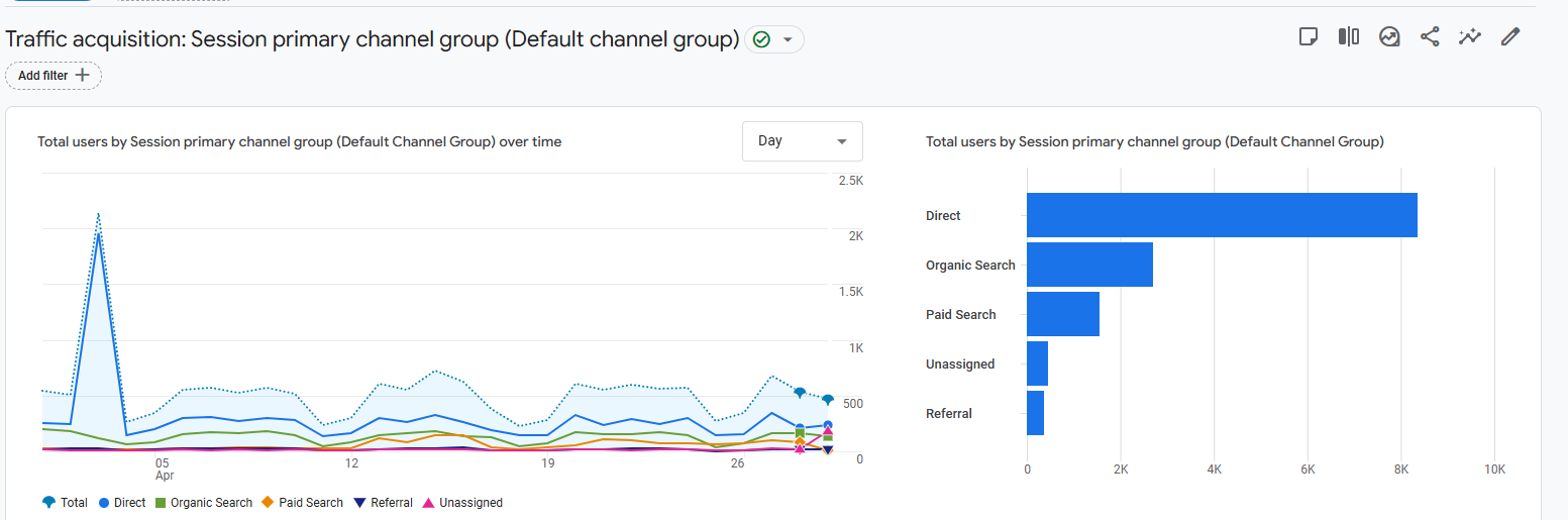
- Find the "Key events" column. Click the dropdown and select the specific event you use to track leads.
2) Then go to your top-traffic pages. Ask honestly: does this page present your service, or does it only present information? If it is purely informational and has no lead capture mechanism, not even a relevant content download - you are generating traffic with no path to a lead.
3) To check the audience fit: think about the last five clients who were a perfect match. The projects were smooth, the brief was clear, and you would take ten more like them tomorrow.
Next, write down three things about each of them:
- What industry were they in?
- What specific problem did they describe when they first reached out?
- What had they already tried before coming to you?
Say the pattern looks like this: head of marketing at a mid-sized HR consultancy, frustrated that their website was getting traffic from Google but generating zero inquiries, had already tried running ads and redesigning the homepage once. That is your real target audience. Not "businesses looking to grow online."
Now open your homepage and read it as if you are that person:
- Does the headline describe their situation?
- Does the copy speak to the problem they actually had?
- Does anything on the page make them feel like you built this specifically for them?
If the answer is no, your website is written for a hypothetical customer. Not the real one who is most likely to hire you. And that’s why websites fail to generate leads.
2) Does your SEO attract buyers or just traffic?
For SEO strategies to raise your website’s lead attracting powers, it has to be optimized for revenue, not just rankings.
Agencies report keyword positions. They report traffic growth. Whether they also report leads generated remains unknown. Because that number is harder to move and harder to attribute.
The result: websites that rank well for informational keywords, attract visitors who aren’t ready to fill the contact form and commit. No leads despite technically healthy SEO metrics.
The grassroot problem is intent.
- A visitor searching 'what is a conversion rate' wants to learn something.
- A visitor entering the query 'how to fix low conversion rate on my website' is in pain and looking for a solution.
- A visitor searching 'website conversion audit agency' is ready to act or buy.
These are three completely different visitors, and they need three completely different pages. Major website conversion issues crop up when:
- Most service business websites only have the third type of page. Service pages, contact forms, an About page. They are present at the decision stage and invisible at every stage before it.
- There are redesign aftereffects. If you recently launched a new website, check your organic traffic in Google Search Console before and after the launch date.
- Go to the Google Search Console dashboard. Click Performance > Search results.
- Click the Date filter at the top of the chart. In the pop-up, select the Compare tab.
- Select Custom to choose your specific ranges and analyze the Difference column.
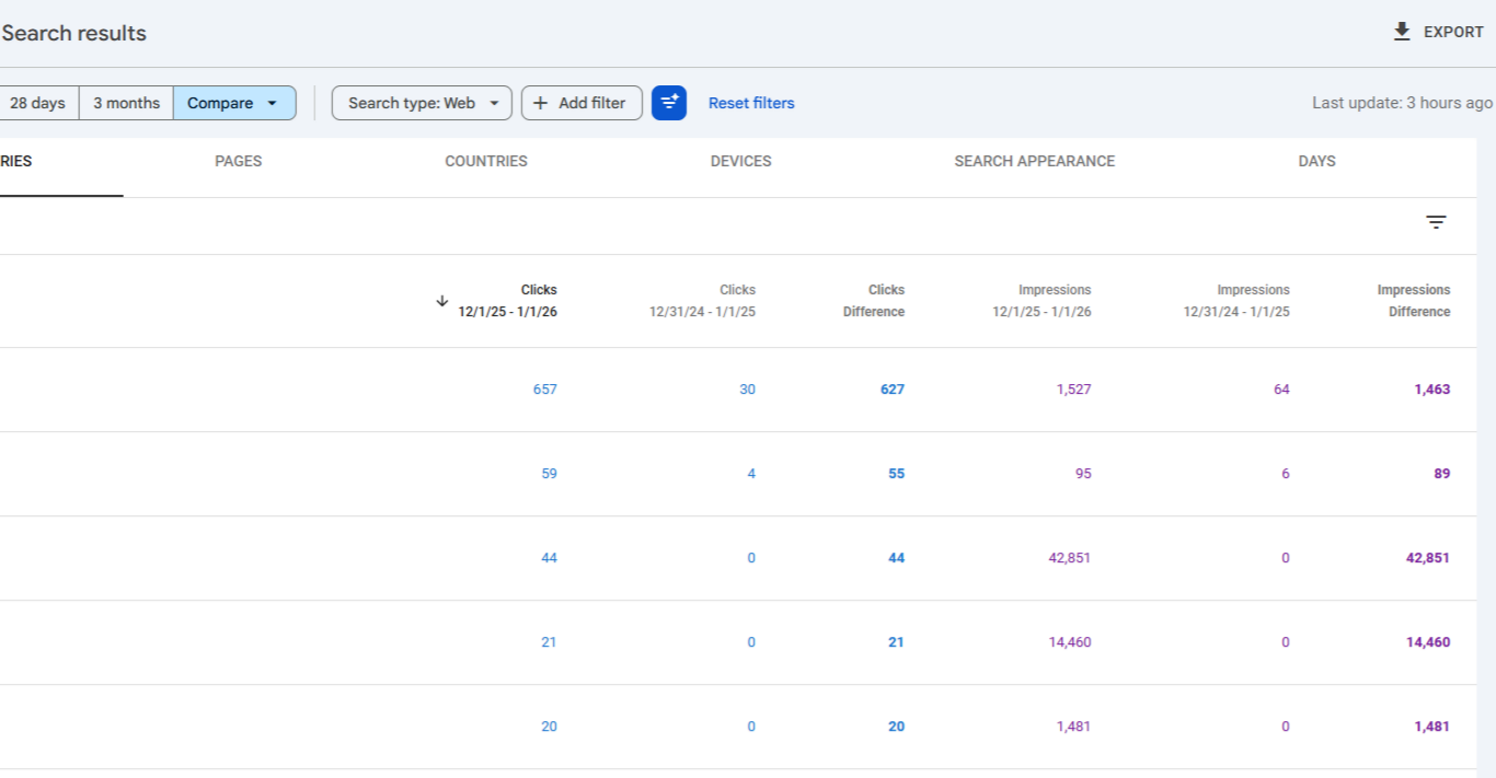
Don’t be surprised if redesigns that change URL structures, remove content, or rewrite page titles without keyword consideration destroy months of accumulated rankings.
Fix it
- For your service offerings, identify the search terms your buyer uses at each of their journey stages. When they first realize they have a problem, when they are comparing solutions, and when they are ready to hire. Make sure you have at least one page for each stage.
- If you have recently relaunched:
- Crawl your old site using a cached version or the Wayback Machine.
- Compare URLs to your new structure.
- Set up 301 redirects for every URL that changed.
- Then verify in Search Console that no important pages are deindexed.
3) Does your website exist for the buyer who is already two-thirds decided?
By the time a B2B buyer contacts a vendor, they are already two-thirds through their decision. Before they talk to your team, they have already researched the problem. Compared options. Read case studies. Formed a preference. And only then do they fill a contact form.
If your website only has service pages and a contact form, you aren't doing enough to help buyers navigate these stages.
Because they’re performing self-guided research, they would want specific "buyer enablement" content to help them do their jobs. When your website lacks these, they exclude you from the shortlist early on.
The competitors generating leads consistently are not doing it because their homepage is prettier. It’s because, they are there at the right place at the right time, in the form of:
- A blog post when the buyer is still figuring out the problem.
- A comparison page when they are weighing options.
- A case study when they are nearly decided.
By the time the buyer is ready to talk, those competitors are already familiar.
Fix it
Understand that your buyer moves through distinct stages of awareness before they are ready to hire:
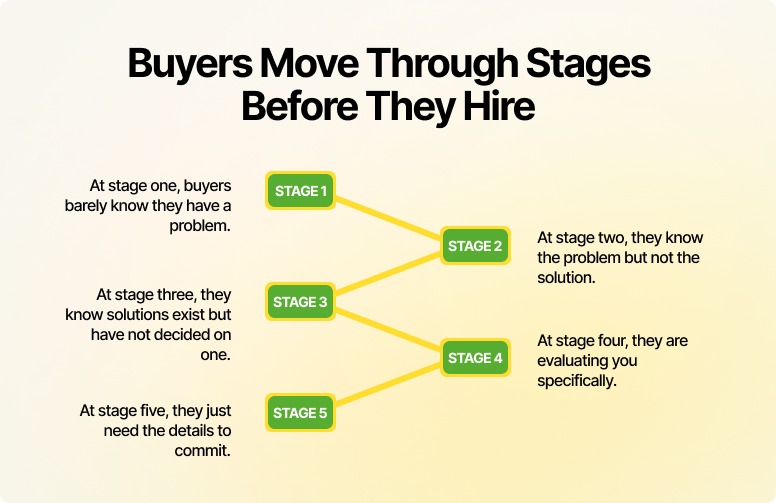
Most service websites only have content for stages four and five, service pages and a contact form. The content gap is wide here. To seal the gap:
- Map what your buyer is searching at each stage.
- Name the actual questions, not the business outcomes.
- Then audit your website: do you have one page that genuinely helps a visitor at each stage?
- If not, start with stage two - the problem-aware visitor. They are actively looking for help. They just have not found you yet.
Stage 2: First impression
They arrived. Now you have a few seconds. Most websites waste most of it.
1) Does your website load before your visitor loses patience?
A slow website does not announce itself.
Visitors do not email you to say they left because the page took four seconds. They just leave. Your analytics show a high bounce rate. You spend months wondering why.
Here is what the data actually says:
- Pages that load in one to three seconds have a bounce rate of around 7%. At five seconds, that number jumps to 38%.
- 53% of mobile visitors abandon a page that takes more than three seconds to load, says Google.
- And for every additional second of load time between zero and five seconds, conversion rates drop by 4.42%, according to Portent research.
Slow speed does not just lose visitors. It signals to Google that your page is not useful, which drops your rankings, which reduces the traffic arriving in the first place. One problem causing three.
And most of your visitors are on mobile. As of 2025, mobile devices account for 62.73% of global web traffic. Many business websites are still designed on a desktop, approved on a desktop, and launched without anyone seriously testing the mobile experience.
Try it yourself. Open your website on your phone. Find your contact details. Read your homepage headline. Fill your lead form. Time how long each step takes. What you find will likely surprise you.
Fix it
- Run your website through Google PageSpeed Insights. Free, takes two minutes. Focus on the Opportunities section first. These are the fixes with the highest impact on load time.
Most of what slows a website down does not require a web development partner to fix:
- Enable browser caching.
- Install a cache plugin.
- Compress images.
- Use a CDN.
These four actions alone address the majority of speed problems on most SMB websites.
- We vouch for image compression as the highest power-packed fix. Images are almost always the largest files on a page and almost always uploaded at full resolution.
Use Squoosh, TinyPNG, Compressor.io, or ShortPixel to reduce image sizes before uploading. If images are already live, a plugin like Smush can batch-compress them in minutes.
- For mobile: do not test on a browser emulator. Test on a real device. Complete your primary conversion action from start to finish. Every point of friction you feel is a point where real visitors are leaving.
If the other fixes don’t do much, look at your hosting.
Cheap shared hosting with WordPress is one of the most consistent performance killers we see. It works fine starting on and slowly degrades as the site grows. Most businesses are too tapped up to connect the five-dollar-a-month hosting decision to why their leads have dried up.
2) Can a stranger tell what you do in five seconds, and why they should care?
Cover your logo. Look at your homepage. Can someone who has never heard of your brand understand what you do, who it is for, and what to do next - in under five seconds?
If the answer is no, it is less of a design problem and more of a clarity problem. Because:
- Users spend less than 15 seconds on a web page on average, with only 55% of page views even receiving that much attention.
- Mobile sessions are 60% shorter.
- And people read only about 28% of the words on any given page.
Clarity problems means you’re writing for readers who’ve long turned into scanners and who’ve already decided whether to stay or leave before they finish the first sentence.
The Nielsen Norman Group's 5-second usability test documents this. The test asks to show users a page for five seconds, then ask what they remember. What stands out, and the tone they perceive, is formed before they consciously start reading.
Krunal Bakraniya, Director of Technology at Mavlers, shares his own experience while auditing a new client's website. The homepage headline is the first thing he looks at.
"If I can't immediately say, "They do X for Y”, in five seconds, we have a problem. Most say something like 'Empowering businesses through innovation'. Which means almost nothing to someone with a pain to solve”-says Krunal.
Not that unclear copy is the only culprit why websites fail to generate leads. Visual clutter also contributes to poor website ux affecting conversions.
More elements do not mean more meaningful information. They mean more hard work for the visitor. They are looking for one clear signal: is this for me?
Two popups, a cookie notice, a five-sentence hero, three navigation CTAs, and a chatbot appearing at the three-second mark is not welcome. It is an obstacle race.
Visual clutter also manifest in less obvious ways:
Extra fonts, five different colors, too many highlights. Each one added for emphasis but they just canceled each other out.
From what we’ve seen, two fonts, four font sizes, and three colours is enough for almost any page.
If your web designer tells you to add more, ask them one question: how does this additional element make the message stronger? If the only answer is 'it looks good', you have your answer.
The other half of this problem is USP.
Once you’ve cleared the clutter, the spotlight is on you. Now you have to say something.
'Quality,' 'expertise,' 'results-driven,' 'client-focused.' Every competitor's website says these things. They’ve become placeholders rather than USPs.
A real USP names something specific that your ideal client cares about, that your competitors either do not do or do not say clearly. It should be specific enough to repel the wrong visitor and pull in the right one. Generic USPs do neither.
Fix it
If you are looking at your website not generating leads what to do first is audit your homepage for elements not actively moving your ideal visitor toward the primary CTA. Remove it or move it below the fold. Keep one goal per page.
For USP:
- Write it as one sentence.
- Name your specific audience, their specific problem, and one specific reason to choose you over others.
- Read it to someone outside your industry. If they cannot immediately repeat back what you do and for whom, rewrite it.
Instead of:
"We offer top-tier digital transformation services for global enterprises to maximize ROI." (Weak USP: No specific audience, vague problem, no clear reason to choose).
Try:
“We help B2B companies fix slow, outdated systems so their teams can close deals faster and reduce manual work” (Strong USP: Specific audience, specific pain, clear reason to choose)
3) Does your visitor know what working with you looks like?
This one is specific to service businesses, and almost universally ignored: you're selling a "what," but the user is terrified of the "how."
A visitor lands on your services page interested. But standing at the edge of a cliff. They want to jump, but they need to know if there's a harness. If they can’t see it - the first call, the onboarding, the week-one deliverables, the next step feels risky to them.
According to Invesp, making the process clear has led to conversion increases of 65.9% to 230% for their clients.When you leave your process vague, the buyer’s brain fills that void with "what-ifs."and what-ifs kill deals.
If they cannot find those answers without emailing you, most of them will not email you. They will find a competitor whose website answers the questions.
To fix it, you have to map out the process. Once the risk feels gone, "yes" becomes the only logical move.
One more thing: detailed FAQ pages don't suffice.
Very few users will navigate away to the FAQs pages, scroll for answers, and return if a doubt hits them while reading your service page. They’ll just bounce.
The answers to your prospects' most common questions belong on the pages where those questions arise, not collected in one place that nobody finds at the right moment.
Fix it
- Add a 'How it works' section to every service page. Three to four steps is enough. The goal is not to document every detail of your process. Just make the invisible visible and give the visitor a mental picture of the process after they reach out.
Like we do it on our web development page.
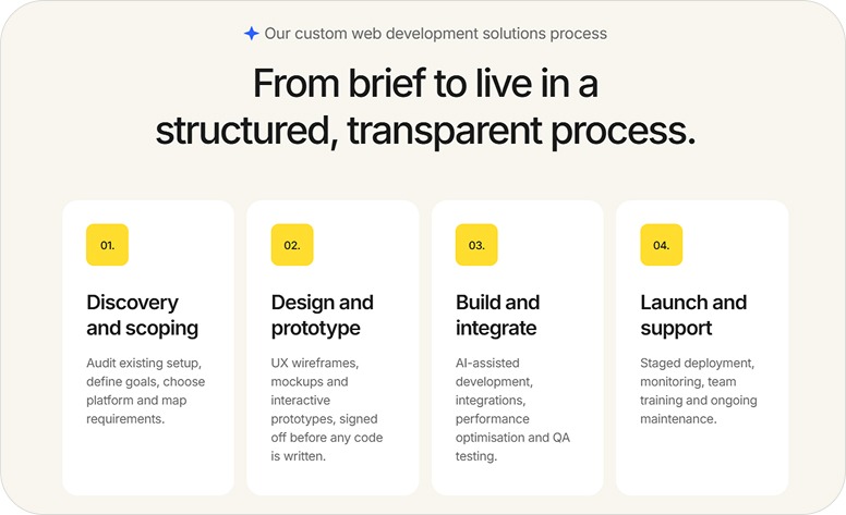
Four steps. Each one named clearly and described in two lines. Devoid of jargon and vague promises. A visitor who reads knows exactly what the engagement looks like before they book a call. That is what lowers the barrier to reaching out.
- Moreover, no need for your process section to be elaborate. It needs to be honest and specific. "We audit your existing setup, define goals, and map requirements" tells the visitor a real experience far more than "we deliver tailored solutions."
Stage 3: Reading and evaluating
They stayed. They are interested. Now they need enough confidence to act. This is where most service websites lose the lead.
1) Is your copy written for your buyer, or does it just sound like every other agency?
Open your homepage. Read the first three paragraphs.
Count the number of times 'we', 'our', and your company name appear. Then count 'you' and 'your'.
Which number wins?
In most business websites, the company wins by a wide margin. That single ratio is one of the most reliable signals of why website bounce rate is high.
Your visitors are not on your website to read about you. They are there because they have a problem and want to know if you can solve it. That look-how-great-we-are content about your history, your team size, your years of experience, or your approach is not answering the question they came to get answered.
There is now a new version of this problem: AI-generated copy.
AI writing tools produce fluent, well-structured, completely interchangeable sentences. 'We help businesses achieve their digital goals through tailored strategies built around their unique needs.' That sentence could belong to any agency on the internet. It probably does.
When visitors read a copy that could have been written for anyone, they feel it was written for no one. Including them.
The fix is not to avoid AI tools. The fix is specificity. Specific industries. Specific problems. Specific outcomes. The language your actual clients used when they described their situation to you for the first time.
Ann Handley, in her book Everybody Writes, puts it this way:
“Count the number of times 'you' appears in your copy. If you run out of fingers, you are doing well. The best copy holds up a mirror to the reader that reflects their situation back at them so precisely that they think: this is exactly my problem.”
While you are auditing your copy, look for answers your visitors seek on your homepage. Not 'what do we do?', they can read that anywhere.
They have three selfish questions: What’s in this for me? Why should I give a damn? And have you helped someone exactly like me before? If your homepage does not answer all three, it’s basically….just there.
Fix it
Go back to the last three to five clients who were a perfect fit. Read whatever they said in their first email or call. The terms they used, the problem they described, the outcome they anticipated. That language, not yours, is what your homepage should be written in.
Then do the we-to-you audit:
- Highlight every sentence that leads with 'we', 'our', or your company name.
- For each one, ask: what does my buyer actually care about here? Rewrite it from that angle.
2) Does your website give visitors enough reason to trust a company they just found?
A visitor who is not ready to trust will not convert into a lead.
- 97% of buyers research a vendor through their website before any engagement: 6sense's Buyer Experience Report
- Yet only 9% of buyers actually trust what they read on a vendor website: G2's Buyer Behavior Report
Nearly every buyer is looking at your website. Almost none of them trust it by default.
You won’t build trust through what you say about yourself. It is built through:
- What others say about you.
- How easy your website is to understand.
- How consistent the website experience feels.
Visitors interpret friction as risk. Confusing navigation, vague service descriptions, hidden pricing create confusion and lowers the chance they move forward.
The problem is: most websites treat trust as decoration. A testimonials section in the footer. A few client logos on the homepage. A case studies page that nobody visits voluntarily. Not that these trust signals are wrong. On the contrary, they’re hands-down effective.
Some numbers from Trustpilot on that note:
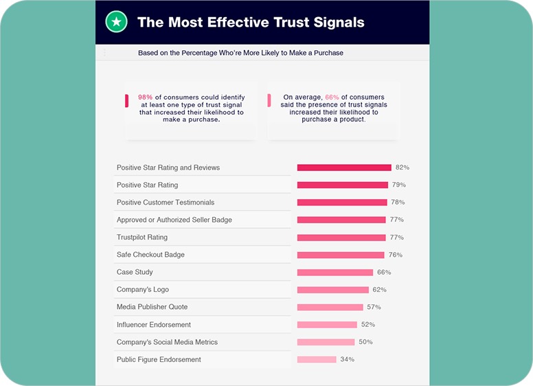
Image source: Trustpilot
The real issue is that a lot of sites have the right trust signals but end up wasting them by putting them in the wrong spots.
Three mistakes that dilute the trust signals your audience need to convert:
- The first is testimonial carousels. Many feel they are bad for UX. We’re one of them. Because they rotate so fast, it is impossible for the visitors to finish reading them, unless there is a pause button.
Try reading your own rotating testimonials from scratch. You will feel the problem immediately.
- The second is a dedicated testimonials page. It assumes your visitor will navigate there voluntarily, find the relevant one, and return to convert. Almost none of them do.
Testimonials are most powerful at the moment of doubt, right before the visitor clicks your CTA or fills your form.
You’ll get more mileage out of one great testimonial placed next to your CTA than a rotating gallery of a carousel of ten. This simple move can fix persistent website conversion issues. May even increase conversions by 25–68%..
- The third is the absence of human elements. Faceless businesses are hard to trust.
Expecting to generate leads on a website that has no photo of real customers, founder or team members, no voice behind the words is the same as asking someone to hand money to a company with no face. Some will. Most will not. Especially when the relationship itself is part of what they are buying.
Therefore, a candid founder photo and two honest paragraphs on your About page helps customers visualize and trust you as their partner.
Fix it
- Map where your trust elements sit today. Then map where your visitor's doubt is highest. The moment before the CTA, the service page where they are comparing you to competitors, the About page, or likes.
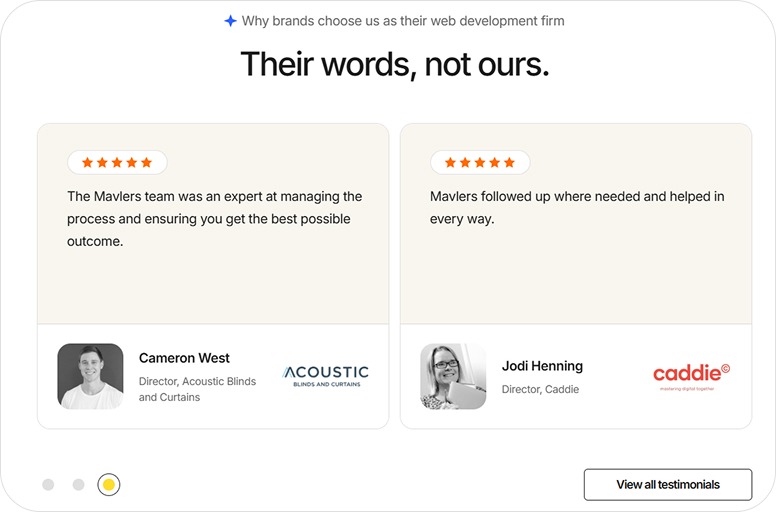
- Replace weak testimonials, the ones that do not name a specific outcome. Ask one question of existing clients: 'What specifically changed after we worked together?' Their answer is your testimonial. You just have to ask for it.
- And take your testimonials off the carousel. Display them statically, in full, on the pages where they are most relevant. Give your visitor enough time to actually read them. Like ours:
4) Why should your visitor choose you, and not the three other tabs they have open right now?
Why websites fail to generate leads is because most websites never answer this question.
They communicate capability well. We do this, we have done it for these clients, here is what we offer. That is not differentiation. That is a list of features.
Your visitor is not just evaluating you. They are evaluating you against alternatives. If your website does not give them a clear, specific reason why you are the right choice for their particular situation, they will make the decision on price, or not make a decision at all.
Most businesses are afraid of specificity here. Naming a specific niche feels limiting. Saying you work best with a certain type of client feels like you are turning people away.
You are. That is the point.
The visitor who sees themselves clearly reflected in your messaging is far more likely to convert than those being addressed in vague, general terms.
The people you “turn away” were unlikely to convert anyway. They would have only taken time to get there.
In fact, 93% of marketers report that moving from generic messaging to more personalized communication improves leads and purchases.
Fix it
Add a 'Who this is for' section to your main service pages. Name the specific situation, industry, or stage your ideal client is in when they need you.
Then , and this takes courage, add a 'Who this is not for' line. It will feel uncomfortable. It will signal expertise and self-awareness faster than any testimonial.
If you are not sure what makes you different, ask your best clients why they chose you over alternatives. Chances are the answer they give is more specific and more compelling than your website copy.
Stage 4: Decision and action
The visitor is interested. They trust you. They are close. This is where weak CTAs and broken forms finish them off.
1) Does your website know which visitors are ready, and treat them differently?
Not everyone who visits your website is ready to hire you today.
Some are. Most are not.
The problem is that many websites have a cookie-cutter treatment for every visitor. One CTA, one path, one ask. That works for the small percentage who are ready to act right now. It fails everyone else.
As in:
A visitor who arrived from a blog post about website conversion problems is probably still in research mode. Sending them straight to a contact form is like proposing on a first date.
A visitor who searched 'website audit agency' is ready to talk. Sending them to a blog post is making someone read the menu after they have already decided to order.
And then there are the CTAs themselves. 'Contact us.' 'Get in touch.' 'Learn more.'
Generic CTAs generate leads poorly because they describe an action without naming an outcome. The visitor does not know what they are signing up for or whether it is worth their time.
Personalized, outcome-driven CTAs consistently convert 202% better than generic or default "Learn more" style buttons.
'Book a free 20-minute website audit' is more specific. It names the action, the time commitment, and what the visitor gets. That specificity reduces the friction that separates interest and action.
CTA placement also matters as much as CTA language. A visitor on your homepage for the first time is unlikely to pick up the phone and book a call.
Save that ask for deeper pages. Such as service pages, case studies, the contact page. Here, the visitor has already spent time and built enough confidence to take a bigger step.
On the homepage, give them a smaller, low-risk, high-value action first. ‘View our case studies’, ‘Get my free proposal’, to name a few.
Fix it
Identify the three stages your buyer passes through before hiring you. Assign a different CTA to each.
- For early-stage visitors: a useful resource, a newsletter, a checklist.
- For mid-stage visitors: a case study, a detailed service page.
- For late-stage visitors: a specific first conversation with the outcome clearly named.
Rewrite your primary CTA as a specific offer. Not 'contact us', but what happens when they do. Test it for 30 days and measure the change in submissions.
2) Is your lead form the last thing standing between your visitor and becoming a lead?
The visitor read the page. They trusted the proof. They clicked the CTA.
Then they saw the lead form.
Name. Company. Email. Phone. Budget. Timeline. How did you hear about us? What are your primary challenges? What does success look like for you? That’s too much of a chore just to get a price quote. So, they closed the tab.
Every extra field is another reason for them to hit the "X" and disappear.
An Unbounce infographic shows that one company reduced their form from 11 to 4 to see increased conversions by 120%. If you are struggling with a website not generating leads, what to do is simplify your forms.
Most businesses design forms around what they want to know, not around what the visitor is willing to share before the first conversation. The resulting form feels like an interrogation that asks for detailed answers before any relationship starts.
Thus, name and email is almost always enough to start. Ask for the minimum, earn the rest later.
Fix it
- Audit your primary form.
- Remove every field that is not essential for the first conversation.
- Unsure whether a field is essential? Ask: could I have a useful first call without this information? If yes, remove it.
- Suppose your service genuinely requires qualifying information upfront, budget, timeline, scope, etc. Then, a good move is to ask for that into the conversation and limit the form to basic details only.
3) What happens to visitors who are interested, but not ready yet?
Most service business websites have two states for a visitor: they fill the form, or they are gone forever.
There is no middle.
This is a structural blind spot. Not every interested visitor is ready to commit to a conversation on their first visit. Some are still researching. Some need to build more confidence. Some are waiting for internal sign-off.
Without a middle step, you lose all of them. Permanently.
To stay on a visitor's radar till the time they hire you, you need to give them some value-based “takeaways”.
If you provide highly-specific lead magnets such as checklists, ROI calculator, cheat sheet, novel insights, or audit report, that's great. For busy customers, these resources must be practical, applicable, and important to spark commercial conversations with you.
Besides, offering actionable resources for free triggers the psychological principle of reciprocity. Visitors are more liable to choose you later because you've already helped them.
Fix it
To stay in your prospects’ head:
- Create one lead magnet that would give ideal client concrete guidance.
- Share your original research and strong POV grounded in verifiable proof points.
- Pair it with a three-to-five email sequence: the first email delivers the resource; the second shares a relevant insight or case study; the third makes a soft, specific offer.
This is the minimum infrastructure for staying in contact with the large majority of visitors who were interested, just not ready today.
Stage 5: After the visit
Most businesses have no strategy for visitors who leave without converting.
1) What happens to the visitors who leave without filling your form?
98% of website visitors leave without converting. That is consistent industry research across sectors and business sizes.
Most businesses accept this as a fact of life. It is. What is not inevitable is having no strategy for those visitors.
E-commerce businesses have entire systems built around this problem. Cart abandonment emails. Retargeting ads. Wishlists. They recognize that interest without conversion is not a dead end. It is the beginning of a follow-up sequence.
Service businesses almost universally do not have this.
A visitor who spent four minutes on your services page and then left was interested. They were not ready. And because you have no way to stay on their radar, you’ve effectively become a stranger again.
Some of them hired a competitor who had a retargeting ad, a useful email sequence, or simply showed up in their inbox at the right moment.
Stop letting these warm leads evaporate.
Fix it
- Go install the Meta pixel and Google tag on your website if you run any paid advertising. It costs zero dollars and takes less than 30 minutes.
- It allows you to serve targeted ads specifically to people who visited your website. That’s the warmest audience you have and converts at a lower cost than a cold audience.
- For email: the lead magnet and sequence from Stage 4 is your follow-up mechanism. A visitor who downloaded your resource is no longer anonymous. You have permission to continue the conversation. Use it deliberately. Deliver value first, introduce your services second, make your offer third.
These are not complex systems. They are the minimum infrastructure that separates businesses that capture leads from businesses that watch interested visitors disappear.
Stage 6: Structural and future-facing
1) Is your website being tested, or just existing?
Most websites are launched once and left.
The agency delivers. The business celebrates. And then the website sits unchanged, and untested, while competitors iterate, Google updates its algorithm, and buyer behaviour shifts.
You only find your website’s performance lags if someone is regularly looking at the data.
Fix it
- Set a recurring reminder for the first Monday of every month.
- Review three numbers: total leads generated, which pages they came from, and your overall conversion rate.
- Write them down. Compare them to last month. That single habit, consistently applied, surfaces more actionable insight than any one-time audit.
- Install Microsoft Clarity or Hotjar, both free. Use these user behavior analytics tools to understand user interaction with your website. Watch five session recordings of real visitors. Where do they stop scrolling? Where do they click that is not a link? Where do they abandon the form?
- You can see where users drop off in a sales process and fix broken elements. This is the only way to identify poor website ux affecting conversions that you might have missed.
2) Is your website built for how people will search in two years, not just how they search today?
Search is changing. Not slowly.
Google's AI Overviews now appear across a significant and growing percentage of commercial search queries. Instead of a list of links, the searcher gets a summarised answer, pulled from pages Google considers authoritative, clearly structured, and directly useful. The links still exist, but they are secondary.
Meaning, the old tricks for ranking on page one are losing their teeth. If AI bots can't make sense of your site structure, your visibility is going to tank over the next few years.
The businesses that’ll own search in three years are already doing the legwork. Which is publishing content that answers specific questions in plain English using a structure machines can parse.
The businesses still writing keyword-dense service pages with vague brand copy will gradually become harder to find, if not disappear overnight.
Beyond content quality, structure matters. Clear topic clustering signals to AI search systems that your website has genuine depth on a subject. A website with one service page and no supporting content is an island. A website with a service page, supporting articles, a case study, and an FAQ, all internally linked, is a body of evidence.
Fix it
- Audit your top five service pages. For each one, identify the three most common questions a potential client asks before hiring you for that service.
- Add a direct answer to each question on that page. In plain language, formatted as a clear question followed by a clear answer. It helps the human visitors, and signals to AI search systems that your page is a credible source.
- Add FAQ schema markup to pages with question-and-answer content. This is a one-time technical task, your developer can complete it in an afternoon, and it improves how search engines read and reuse your content.
- Commit to one genuinely useful, high-intent content piece per quarter. Not a promotional article. A piece that answers a specific question your buyer is actually asking, in full, with real depth. Over time, these become your most durable source of qualified traffic, and they are almost impossible for competitors to replicate quickly.
If you are just learning about AI-search visibility, I highly recommend reading this guide on “How to make your content AI-citable?”
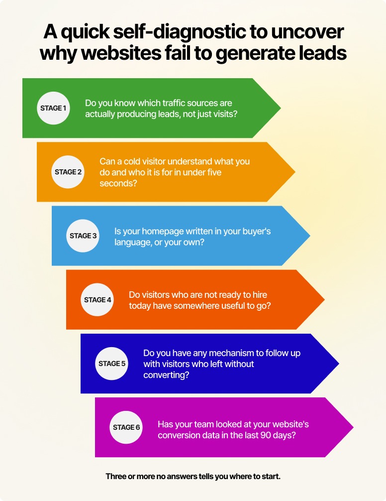
Where is your website actually breaking down?
If you are constantly asking why my website gets traffic but no leads, read back through the six stages. High chances that it’s usually a combination of small failures across these stages.
You don't need a top-to-bottom overhaul today. Figure out where your website is failing the hardest and make that your first win. Here’s a quick breakdown of that:
What to do next
Now you know why websites fail to generate leads. Pick the stage where your website is most clearly failing in generating qualified prospects. Optimize one. Measure it. Move on to the next stage.
The websites that generate leads consistently are the ones being consciously maintained, tested, and improved as a business asset. A website is never "finished."
If you want a shortcut to getting this right, let the Mavlers team audit your site across all six stages. Our experts will identify points where visitors are dropping off and what to prioritize first. It is a more practical alternative to spending months working through each stage alone.

.png)
